Brand & Retail Design
Aramark - Local Brand
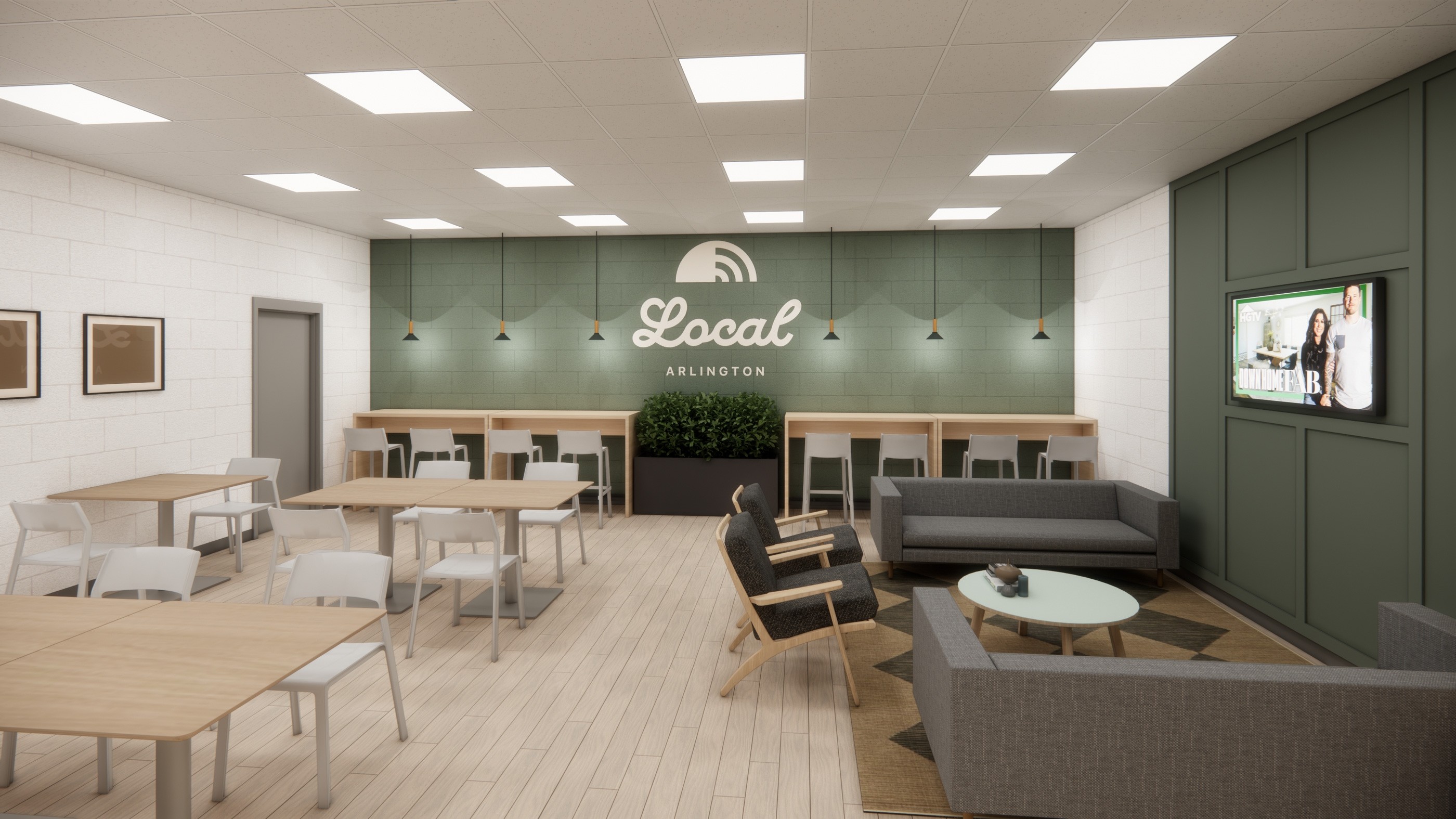
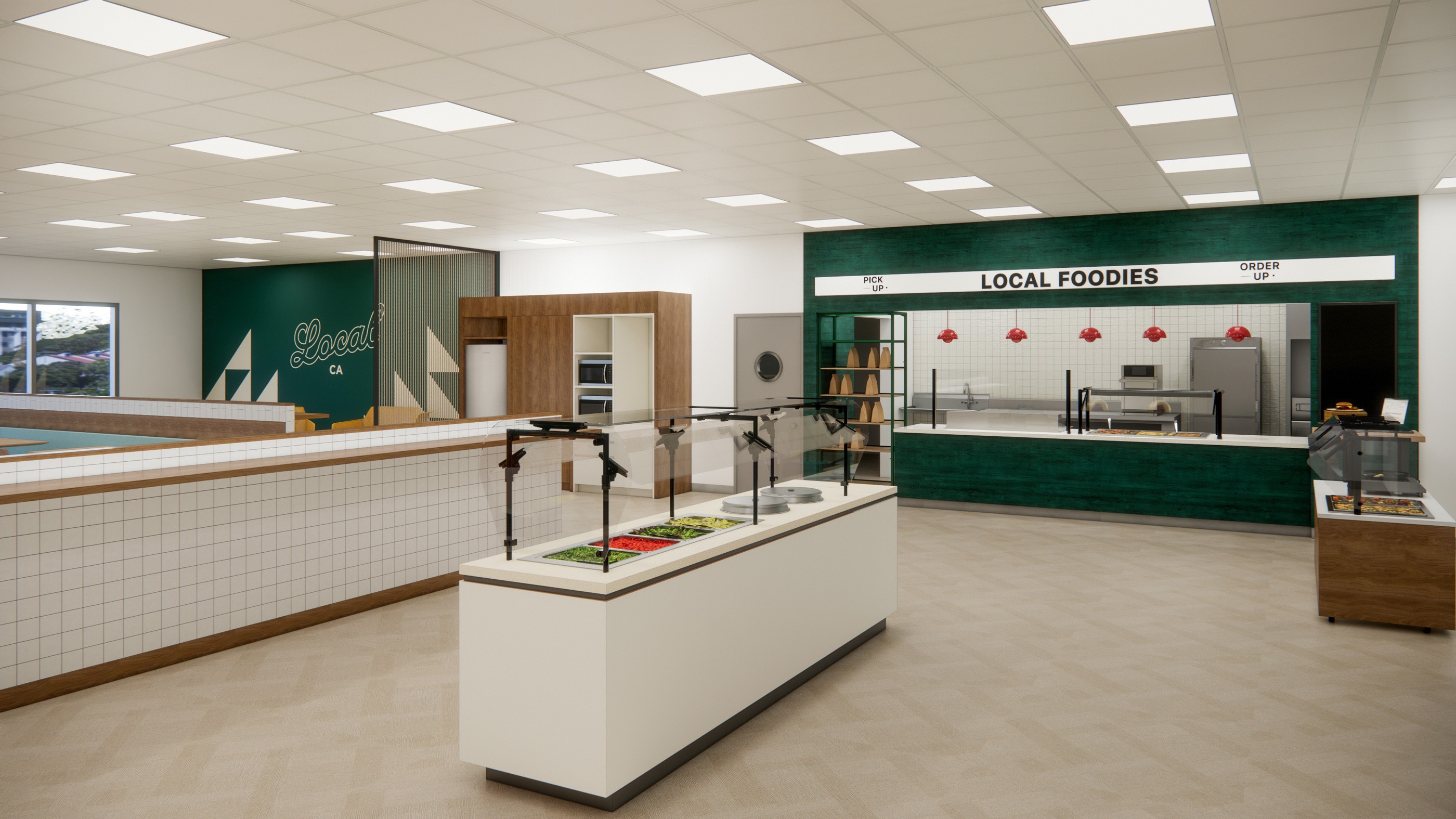
The LOCAL brand had long served as Aramark Corrections’ primary dining brand, but its expression felt singular and limiting. With only one aesthetic to pull from, operators struggled to make the brand feel relevant to different facilities, regions, and communities. Aramark needed a way to keep the core identity intact while giving teams more flexibility and ownership over how LOCAL showed up in their spaces.
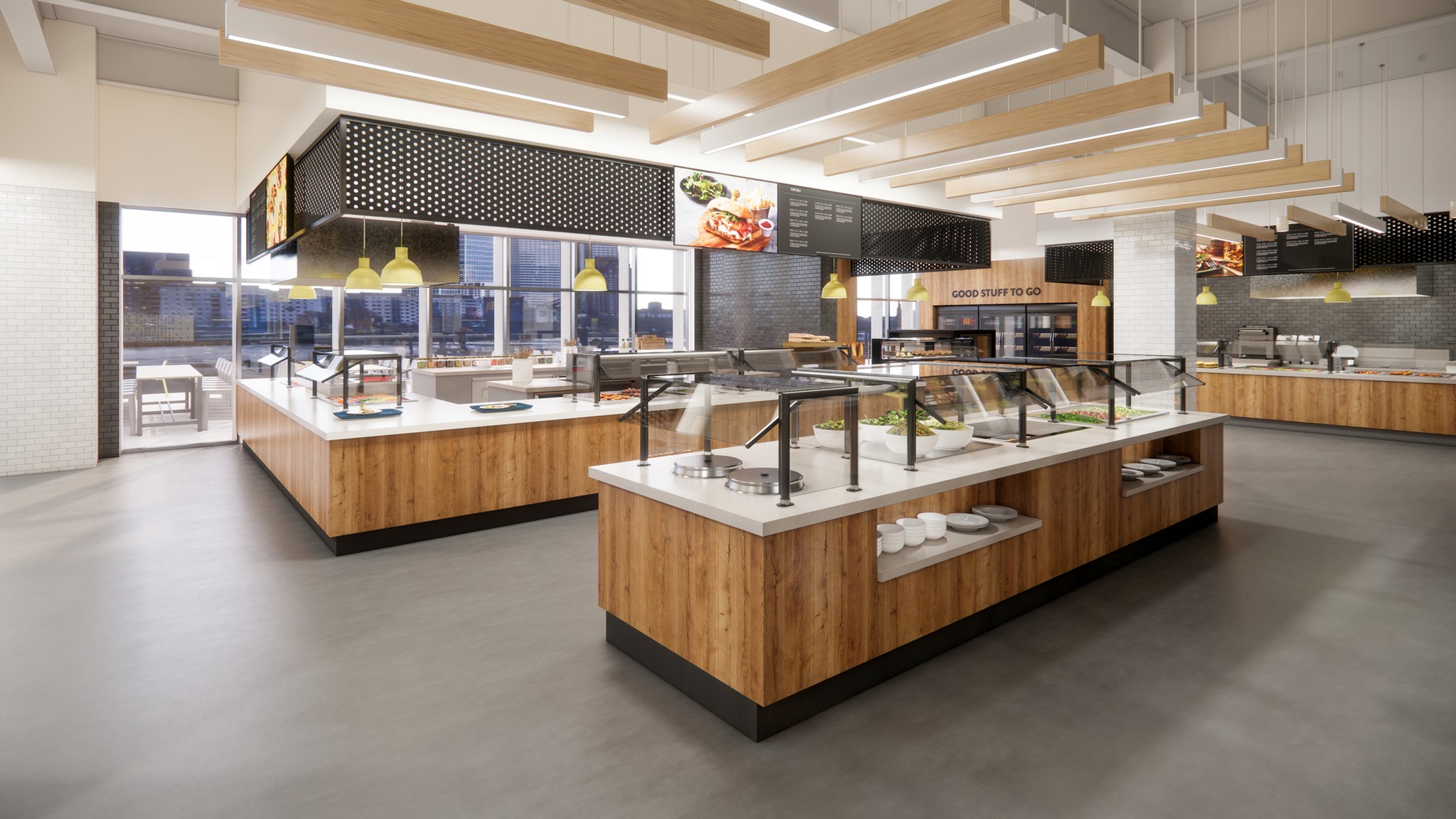
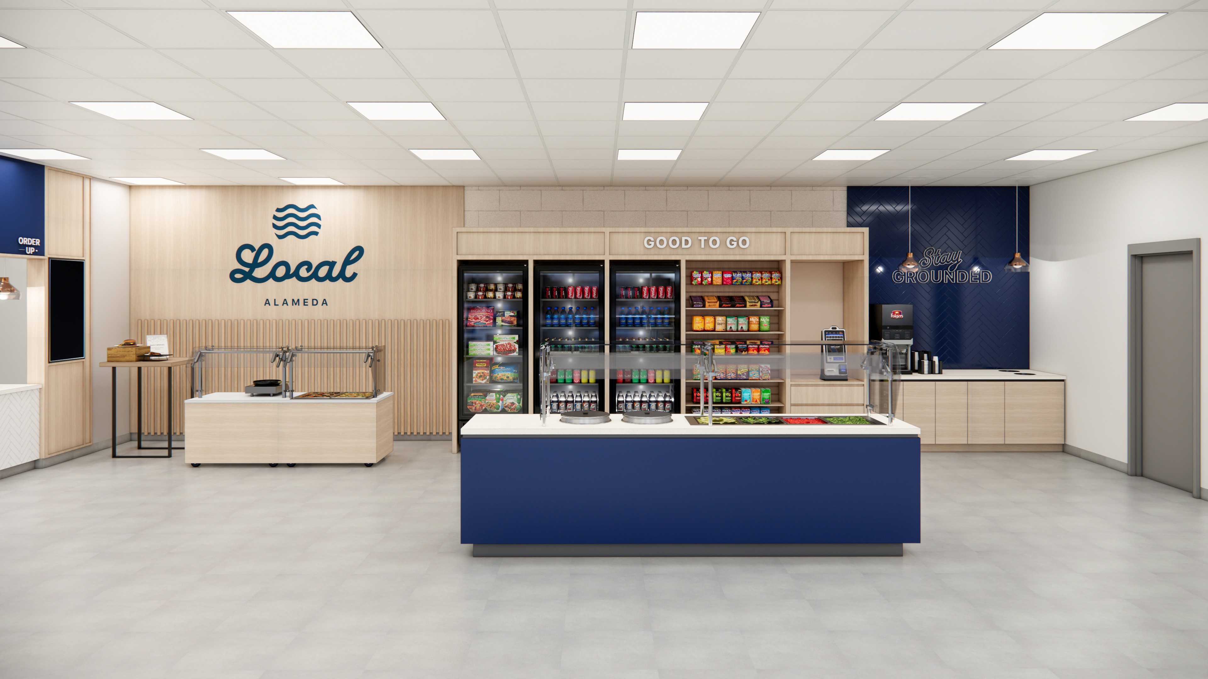
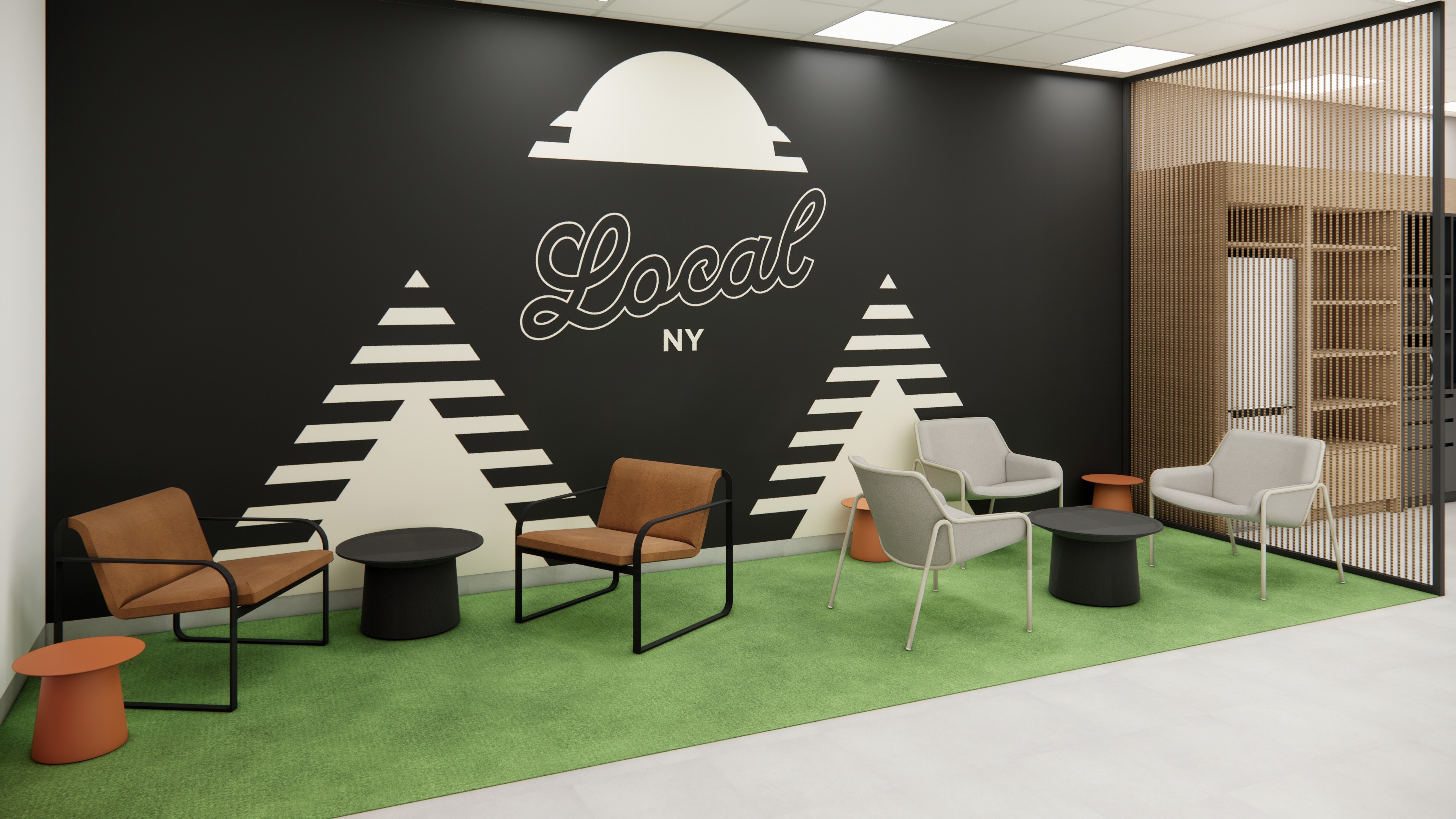
We partnered with the Corrections team to refresh and expand the brand into four distinct visual expressions, each offering its own palette, patterns, and personality. This system allows regions to choose the look that best aligns with their environment, bringing a level of customization that didn’t exist before, while still maintaining brand consistency across the portfolio.
Alongside the refreshed identity, we developed a scalable environmental kit that could work in anything from a full café update to a light-touch refresh. Conversational wayfinding, updated station signage, millwork-friendly graphics, and flexible wall treatments were designed to install quickly and adapt to aging footprints and tight budgets.
By broadening the brand's visual vocabulary and creating a modular set of tools, Aramark can now localize the dining experience across facilities, making each café feel more intentional, more welcoming, and more connected to the community it serves.
Client
Aramark
Category
Brand & Retail Design
Role
Brand & Architecture
More projects